Whenever we design new elements in Glaass, we strictly follow three core user interface principals. These are in place to ensure our new features align with our existing design ethos and are so easy to use, they require no explanation or training. These are our rules!
Rule 1 It must be visual
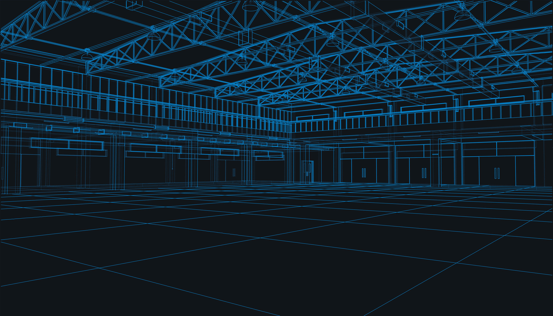
We believe software should be beautiful. Like a piece of artwork that evolves over time with updates and refinements. This beauty in design must simultaneously deliver enhanced functionality. An example of this our dark theme interface contrasted by coloured icons that denote activities status. The user therefore experiences both aesthetics and functional efficiency.
Rule 2 It must be consistent
In each of the working areas in Glaass we design cases to visually appear similar to each other. This gives the user a sense of familiarity which breeds confidence. We use techniques like adopting identical icons, layouts, colours and fonts. It sounds logical but it’s difficult to execute when you’re purposefully constricting your design choices for the sake of consistency. We apply this approach to our mobile experience too, so swapping between devices is seamless.
Rule 3 It must be simple
This is the most difficult rule to follow. The greater the functionality, the harder it becomes to maintain simplicity as the user interface becomes cluttered with additional icons and buttons. On every screen we aspire to minimise the elements to give a more directional and clear path to the user. It’s often a question of what must go, rather than what must stay.